At Sequoia’s AI Ascent conference in March, I talked about three limitations for agents: planning, UX, and memory. Check out that talk here. Since UX for agents is such a wide-ranging topic, we’ve split our discussion of it into three posts. See the first blog post on chat UX and the second on ambient UX. This is our third post on UX for agents, focused on spreadsheet, generative, and collaborative UI/UX.
This is my third post on agent UX, but I could probably dive into ten more — there is so much to explore as we all figure out the best ways to build and interact with agents. The UI/UX space for agents is one of the spaces I am most excited about and will be watching closely for innovation in the coming months.
In an attempt to wrap up the discussion on agent UI/UX, I’ll highlight three lesser-known UXs that have recently become more popular. Each of these could easily deserve its own blog post (which may happen down the line!).
Spreadsheet UX
One UX paradigm I’ve seen a lot in the past ~2 months is a spreadsheet UX. I first saw this when Matrices, an AI-native spreadsheet, was launched earlier this year.

I loved seeing this. First and foremost, the spreadsheet UX a super intuitive and user friendly way to support batch workloads. Each cell becomes it own agent, going to off to research a particular thing. This batching allows users to scale up and interact with multiple agents simultaneously.
There are other benefits of this UX as well. The spreadsheet format is a very common UX familiar to most users, so it fits in well with existing workflows. This type of UX is perfect for data enrichment, a common LLM use case where each column can represent a different attribute to enrich.
Since then, I’ve seen this UX pop up in a few places (Clay and Otto are two great examples of this).
Generative UI
The concept of “generative UI” can mean a few different things.
One interpretation is a truly generative UI where the model generates the raw components to display. This is similar to applications like WebSim. Under the hood, the agent is largely writing raw HTML, allowing it to have FULL control over what is displayed. However, this approach allows for a lot of variability in the quality of the generated HTML, so the end result may look a bit wild or unpolished.

Another more constrained approach to generative UI involves programmatically mapping the LLM response to different pre-defined UI components. This is often done with tool calls. For instance, if an LLM calls a weather API, it then triggers the rendering of a weather map UI component. Since the components rendered are not truly generated (but more chosen), the resulting UI will be more polished, though less flexible in what it can generate.
You can learn more about generative UI in our video series here.
Collaborative UX
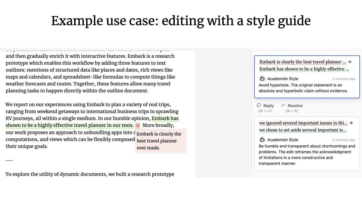
A lesser explored UX: what happens when agents and humans are working together? Think Google Docs, where you can collaborate with teammates on writing or editing documents - but instead, one of your collaborators is an agent.
The leading thinkers in the space in my mind are Geoffrey Litt and Ink & Switch, with their Patchwork project being a great example of human-agent collaboration.

How does collaborative UX compare to the previously discussed ambient UX? Our founding engineer Nuno highlights the key differences between the two:
The main difference between ambient and collaborative is concurrency:
- In a collaborative UX, you and the LLM often do work simultaneously, "feeding" off of each others work
- In an ambient UX, the LLM is continuously doing work in the background while you, the user, focus on something else entirely
These differences also translate into distinct requirements when building these applications:
- For collaborative UX, you may need to display granular pieces of work being done by the LLM. (This falls somewhere on the spectrum between individual tokens and larger, application-specific pieces of work like paragraphs in a text editor). A common requirement might be having an automated way to merge concurrent changes, similar to how Google Doc manages real-time collaboration.
- For ambient UX, you may need to summarize the work done by the LLM or highlight any changes. A common requirement might be to trigger a run from an event that happened in some other system, e.g. via a webhook.
Why are we thinking about this?
LangChain is not known for being a UI/UX focused company. But we spend a lot of time thinking about this. Why?
Our goal is to make it as easy as possible to build agentic applications. How humans interact with these applications greatly affects the type of infrastructure that we need to build.
For example - we recently launched LangGraph Cloud, our infrastructure for deploying agentic applications at scale. It features multiple streaming modes, support for “double-texting” use cases, and async background runs. All of these were directly influenced by UI/UX trends that we saw emerging.
If you are building an application with a novel or interesting UI/UX (e.g. non-streaming chat) we would love to hear from you at hello@langchain.dev!

